The Importance of Typography in Advertising

One of the most underestimated elements of advertising is typography. However, it’s critical in both print and web media.
Typography is the art of creating and arranging text in a visual manner. With all the advertising placed in front of consumers on a daily basis, it’s important to design and use type in such a way that it attracts the reader’s attention and gives them a clear understanding of your message.
If you are reading this article, you might be wondering if hiring a branding design agency will help your business. Check out our marketing case studies to get an idea of how we can help you.
Things to consider when arranging typography in advertising is font, point size, color and line length. Type must be readable and visually appealing. In this article we will take a closer look at what makes some typography good, and other typography not so good.
Typography in Print Advertising
Typography is important in advertising because it tells the consumer what they’re reading and why it’s important to them. Typography influences how readers process information, and the most successful typography also engages the consumer.
Good Typography

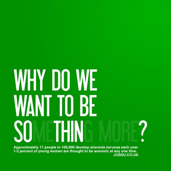
The above print ad is a great example of the power of typography. The contrast between the green background and the white lettering combined with the short, two to three word lines of text makes it easy to read.
The large font is impactful, and the use of transparency makes certain letters more ambiguous, thereby highlighting the meaning of the ad. The details are then laid out underneath the title, but are only presented after the title grabs the reader's attention.
Bad Typography

The ad for Honey Boo Boo’s Christmas Drive is the epitome of bad typography. There are too many different fonts, colors, and line heights, and with text scattered haphazardly throughout the whole ad, the reader doesn’t know where to begin.
All of the text is emphasized, leaving the reader confused and uncertain of which part is the most important. There is not a clear direction for how this information should be read.
Typography on the Web
When it comes to the web, the way text is presented is essential because readers want the information they're looking for as quickly as possible. Tony Haile of Chartbeat notes that websites only have about 15 seconds to capture someone's attention (1).
Because of this, the aesthetics of a website are key to a great user experience and making a lasting impression. Web designers must use page titles, headings and other such elements in order to set a hierarchy and define relationships between various elements. Not only do headings tell the reader what’s important, but they also allow search engines to find the correct keywords.
H1 tags have the highest priority, should contain the most important keywords, and highlight the topic of the article. They are what your readers see when they skim the page to determine whether your content is worth their time. H2 tags are next in line, H3 tags, and so on. The P tags should contain the details of your article, post or page.
Good Typography

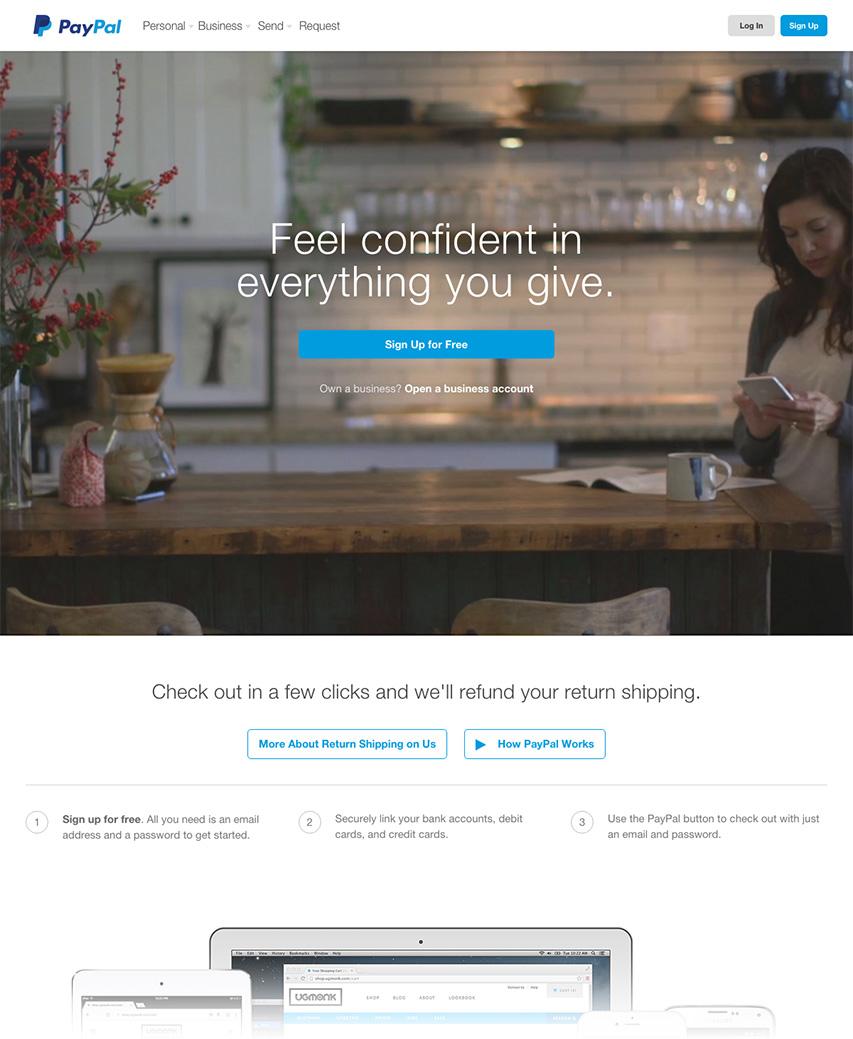
The website above is a classic example of good typography. The title is front and center and is the first thing the viewer reads. The link below is obvious and clear about what page it will navigate to, and the text below the image describes the message presented in the title. The visitor knows exactly what the material is and doesn't feel overwhelmed in the process of receiving that information. The design of the web page and the treatment of the text is visually appealing and is also easy to comprehend.
These practices will help you create a website that not only engages your visitors, but also keeps your bounce rates down. Bounce rates are the percentage of website visits that leave a site after viewing only one page. If your headings are straightforward and relevant, and your content is detailed and on topic, your bounce rates should be low. However, if you have too many headers, a disorderly design, or extraneous content, users are more likely to leave your site and not read it.
It's important to limit the use of titles, have easily identifiable navigation links, and line spacing that gives the text room to breathe. Other things to consider are the use of caps and small caps, bold letters, italics, and underlines. These things help emphasize a point, but overusing them can lead to confusion and an unattractive aesthetic that will drive people away from your website. You should also take into consideration mobile users and select larger fonts on smaller devices.
5 Examples of Good and Bad Typographic Styling
Font choice, color combinations, emphasis, hierarchy, and line height all play an important role in typography. The following examples of each are meant to help you get a better understanding of what makes typography good or bad.
Font Choice
Good Font ChoiceThe title uses a nice, bold font that's easy to read right off the bat. The shapes of each letter and the spacing between them looks balanced in both the header and this body text. |
Bad Font ChoiceAt a glance, the squished script font in the title looks like a blob. The typewriter-style font in this paragraph is spread out so far that your eyes have to jump from word to word. And, the addition of another font is just confusing. |
Color Combinations
Good Color CombinationThe limited colors here are easy on the eyes. Only using one or two colors like this allows the reader to focus on the message. Any more than that, and the colors are just distracting. |
Bad Color CombinationWhat do you focus on here? It's hard to tell what's important because too many colors are being used. And, yellow was the wrong color to choose. It's way to bright to read in this situation. |
Hierarchy
Good HierarchyThe hierarchy is clearly laid out from top to bottom. The top item here is the title, so readers know what the section will be talking about. The subtitle is smaller, but still bold, and then the paragraph is normal. Things are ordered by importance, so it's easy for the reader to scan the text. |
|
Bad Hierarchy The focus is not where it should be. You can't immediately tell what this section is about because the hierarchy is off. The details are what stand out, not the title, because they are larger and bolded. Readers can't quickly look at this section and understand what they'll be reading more about. |
Emphasis
Good EmphasisThis example has one phrase bolded, which puts the focus right on it. It's not overused, and only one emphasis style is being implemented. |
Bad EmphasisThis paragraph uses multiple emphasis styles, which is confusing to readers. Do you pay attention to the italicized words, the underlines, or the bold text? So many things are emphasized that nothing has become emphasized. It looks disorganized, and you can't tell what's actually important. |
Line Height
Good Line HeightThe vertical spacing between the lines in this paragraph are far enough apart that you can easily read the sentences, but they're not so far apart that you can't tell that they're part of the same paragraph. |
Bad Line HeightThe vertical spacing here is inconsistent and awkward. The spacing between paragraphs is different, when it should be the same. And, there's so much space between lines that they look like paragraph breaks. |
Typography Guidelines
It's also important for a company's typography to be consistent across all print and web media so that their brand stays consistent. Because of this, it is critical for a company to develop corporate identity guidelines. As staff may change, the guidelines ensure that the identity of the company can be used with consistency and accuracy.
Corporate identity guidelines should include at the very least, your company's logo and any logo variations, use of the logo including size and spacing, your company colors, and font families. We also recommend including web styles such as font family, size, and line height.
Here is an example of a corporate identity brand board we created for Myridium. Get inspiration for a complete corporate identity guide in this article on the Hubspot marketing blog (2).
You can also check out our article about how to market your industrial logo to see great examples of good, consistent typography in logos.


